ARKE
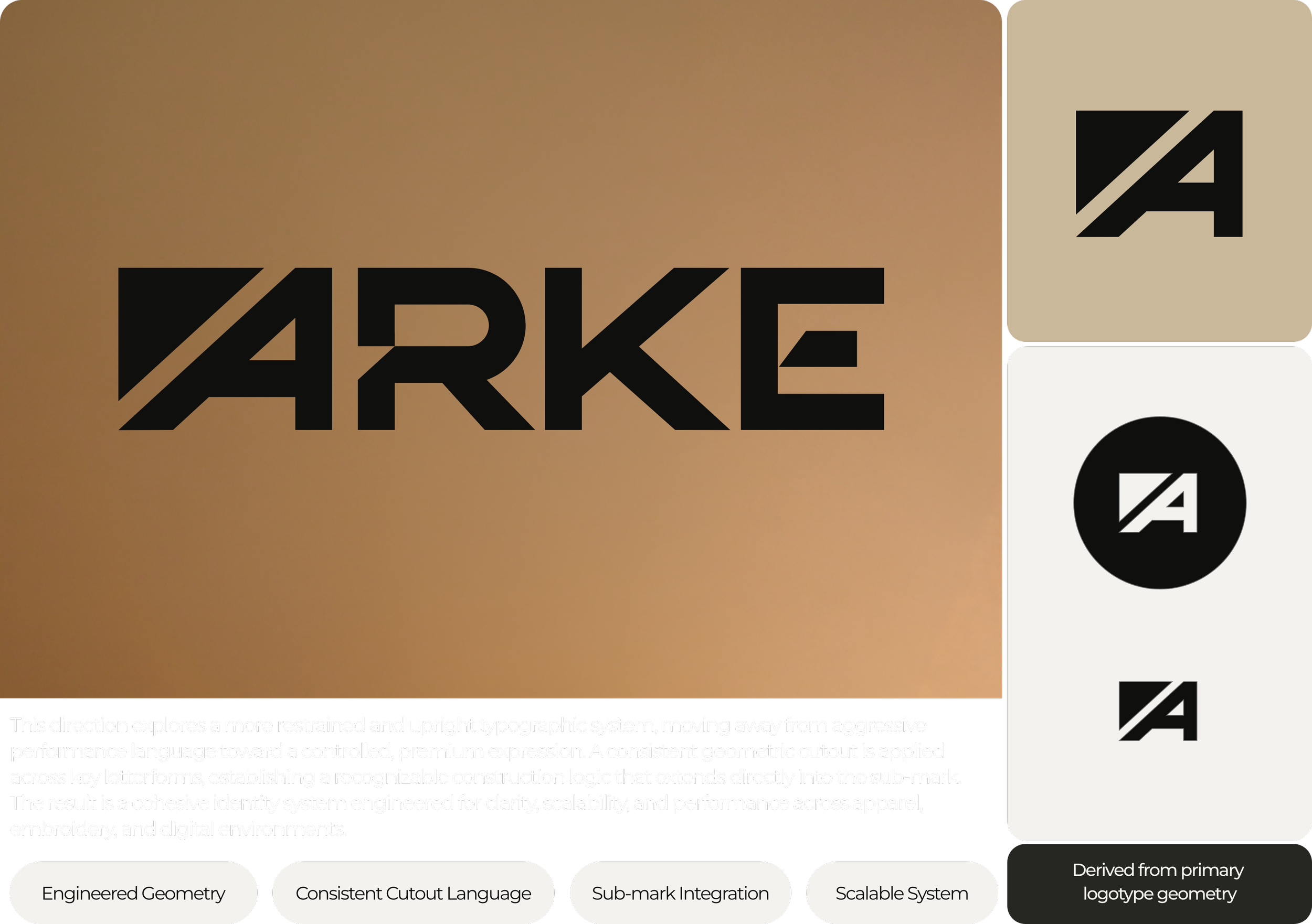
The visual direction balances modern sportswear aesthetics with a more structured and premium identity language. A distinctive diagonal cutout system became the defining element of the brand, helping the logo feel recognizable, technical, and highly adaptable across different applications.
Engineered performance apparel built through a refined logo-led brand identity system.
ARKE was developed as a premium performance apparel brand focused on precision, movement, and engineered simplicity. The project centered around creating a bold custom wordmark and scalable sub-mark system capable of performing consistently across apparel, embroidery, digital applications, and future brand expansion.

Visual Identity System
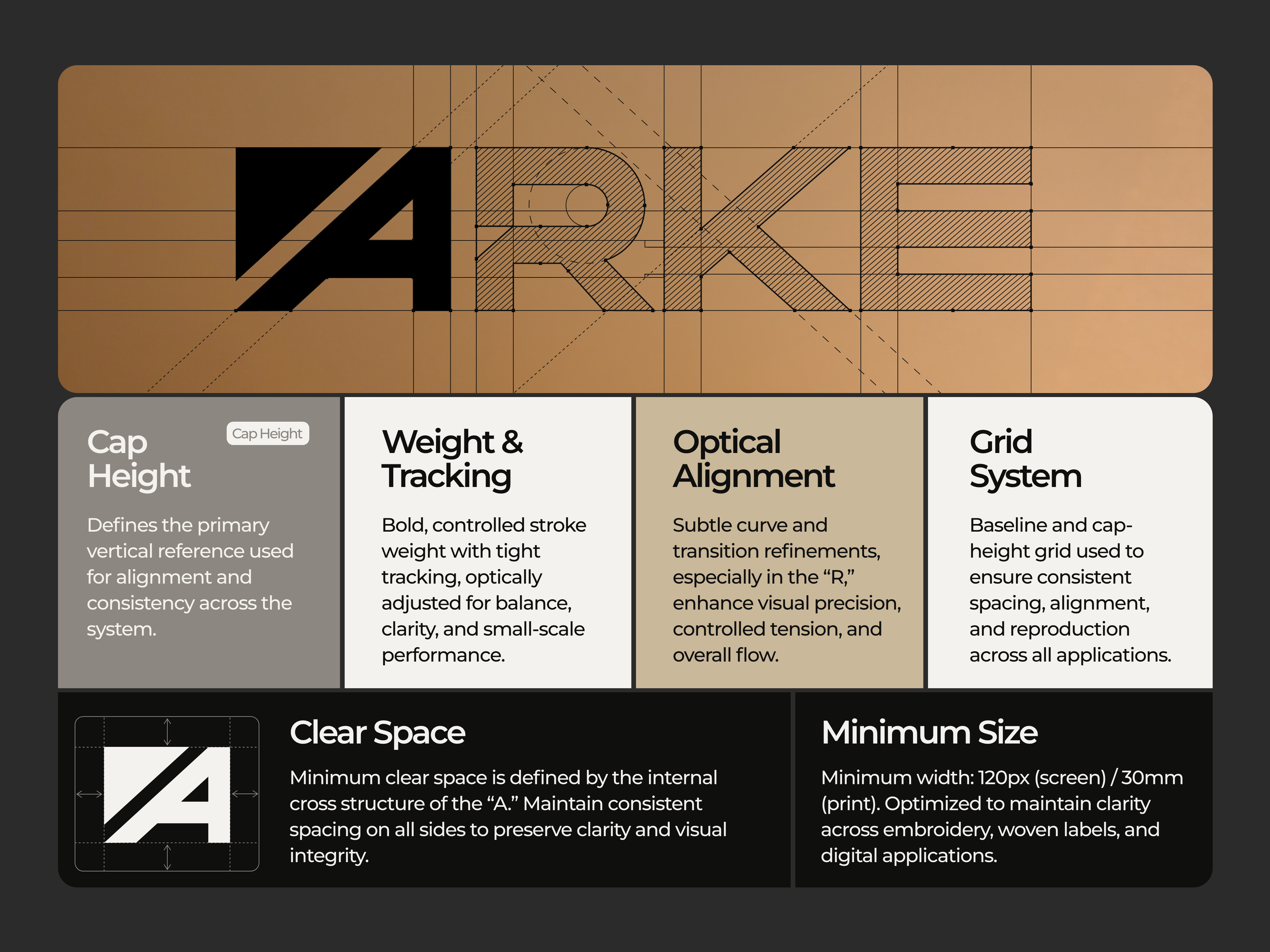
The identity system was designed to feel controlled, scalable, and production-ready from the beginning. The custom typography structure introduces geometric precision while maintaining strong readability at both large and micro scales.
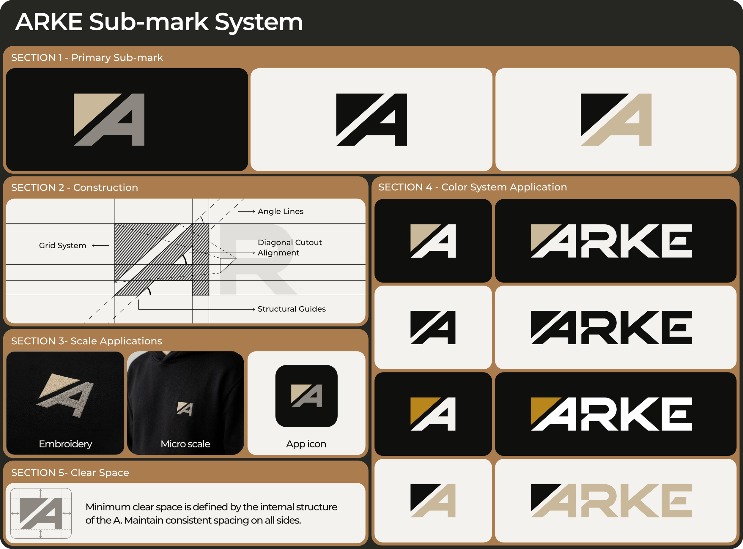
Alongside the primary wordmark, a standalone sub-mark system was developed for smaller applications such as embroidery, favicon systems, apparel patches, and social avatars. Every element was refined to maintain clarity, balance, and consistency across both physical and digital environments.

Color Strategy & Brand Direction
The color system was intentionally restrained to support a more premium and engineered visual atmosphere. Black, Chalk, Tungsten, and Bone established the core palette, while a Brass accent system was introduced selectively through the diagonal cutout element to create subtle visual distinction.
Rather than relying on loud athletic branding clichés, the direction focused on cinematic contrast, metallic warmth, and modern performance-driven minimalism. This allowed the brand to feel elevated, technical, and adaptable across high-end apparel and digital presentation systems.
Final Outcome
The final result is a cohesive logo and brand identity system designed to scale naturally across apparel branding, embroidery production, digital interfaces, packaging, and future brand extensions.
The project delivered a complete production-ready system including custom wordmark design, standalone sub-mark applications, structured color specifications, scalable logo usage systems, and refined presentation assets optimized for both manufacturing and digital brand experiences.