
BATIS Project Overview
LOGO DESIGN
BRAND IDENTITY DESIGN
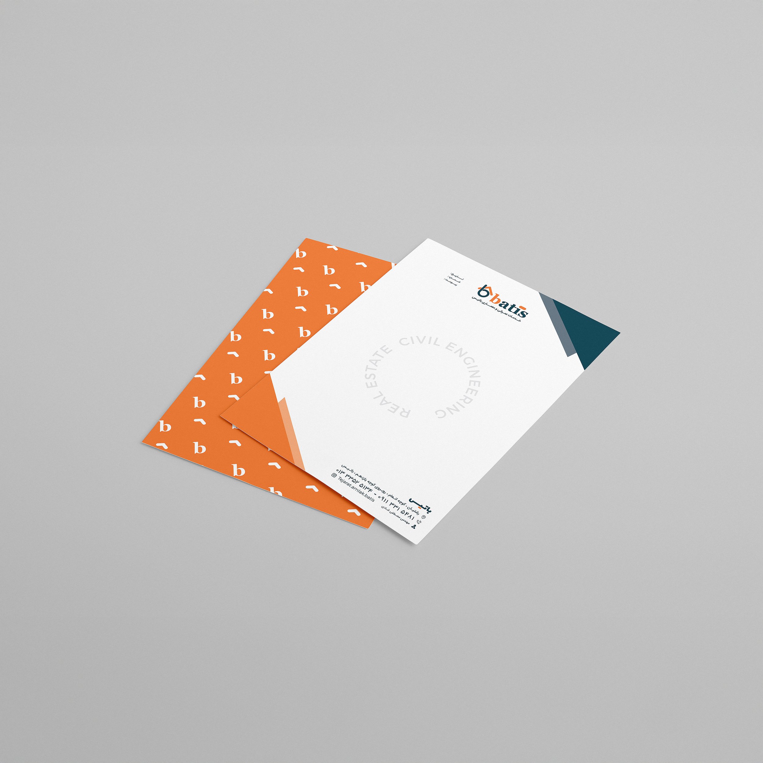
BATIS was a real estate branding project completed in 2017. The goal was to create a unique, memorable logo and brand identity that reflects trust, home comfort, and modern professionalism. The logo design cleverly integrates the letter “B” with a house silhouette, symbolizing real estate and shelter.

Design Process
The logo was crafted using simple geometric shapes to merge the “B” letterform with the outline of a house. This fusion visually communicates the brand’s core business: real estate and housing. I selected a fresh color palette combining green and orange—green for growth and stability, orange for warmth and friendliness.
The brand identity extended to business cards, signage, and marketing collateral, maintaining consistency across all touchpoints.


Challenges & Solutions
A key challenge was to balance simplicity and symbolism, ensuring the logo is versatile and recognizable at different scales. By refining the letterform and house shape to be minimal yet distinctive, I ensured the logo works well in both digital and print formats.


Final Outcome
The final logo and brand identity successfully positioned BATIS as a trustworthy and approachable real estate brand. The design helped attract clients by evoking feelings of security and warmth, essential for the industry.


Tools Used
Adobe Illustrator
Adobe Photoshop