


Good Friction — Logo & Brand Identity for a CX Lab
Logo & Brand Identity for a CX Lab
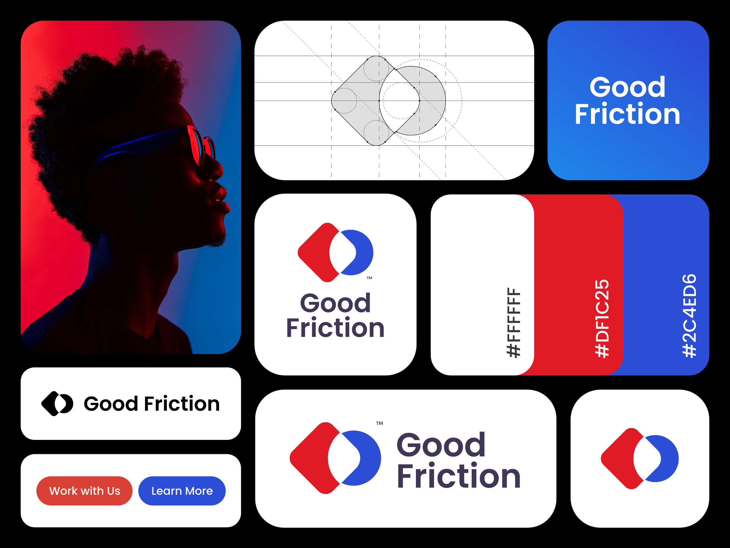
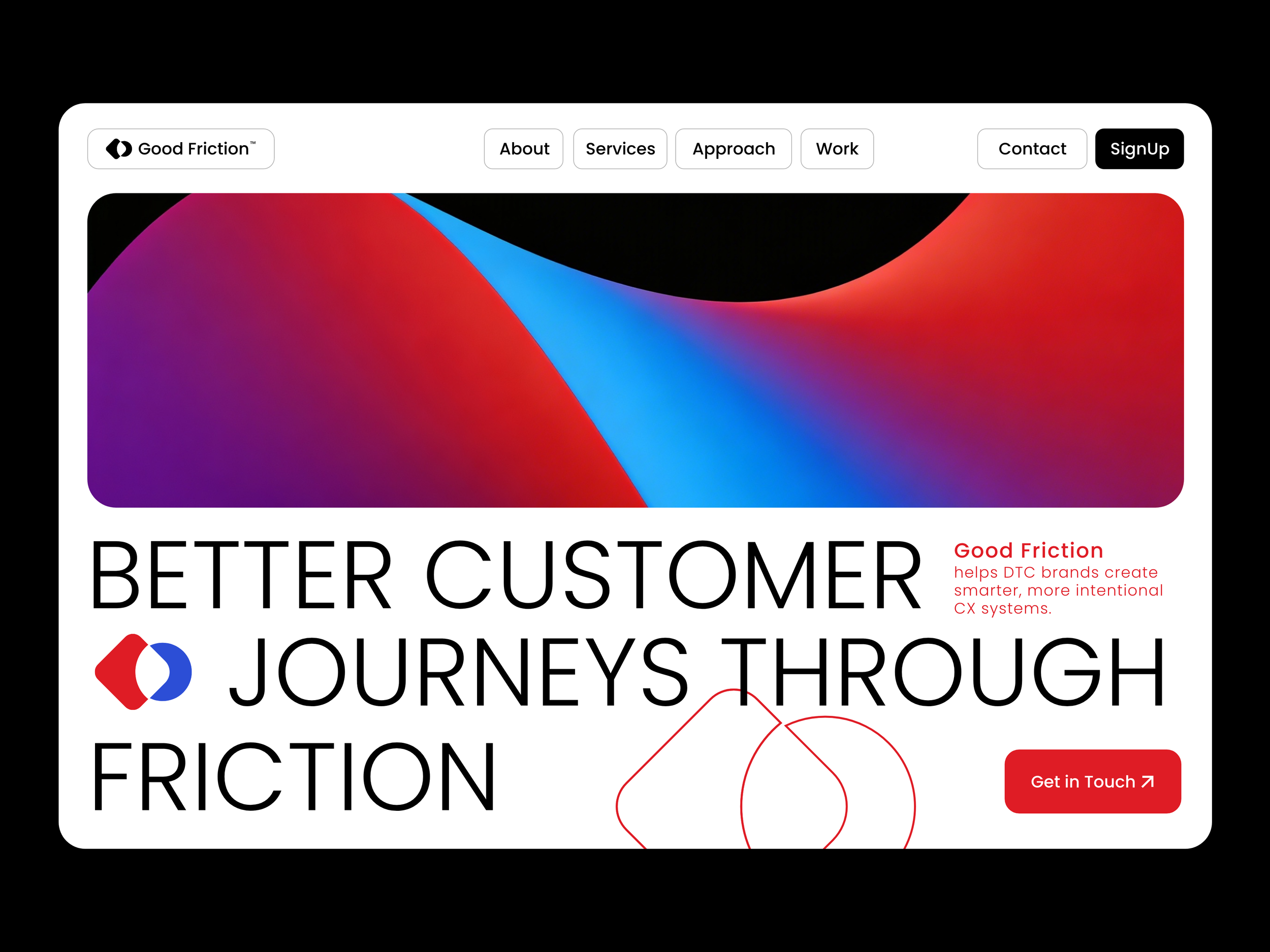
Good Friction is a customer experience lab for direct-to-consumer brands. I designed its logo and visual identity around the relationship between human empathy and technical structure. A geometric mark, supporting wordmark, and red-and-blue palette express constructive friction across digital brand applications.
Tools & Process
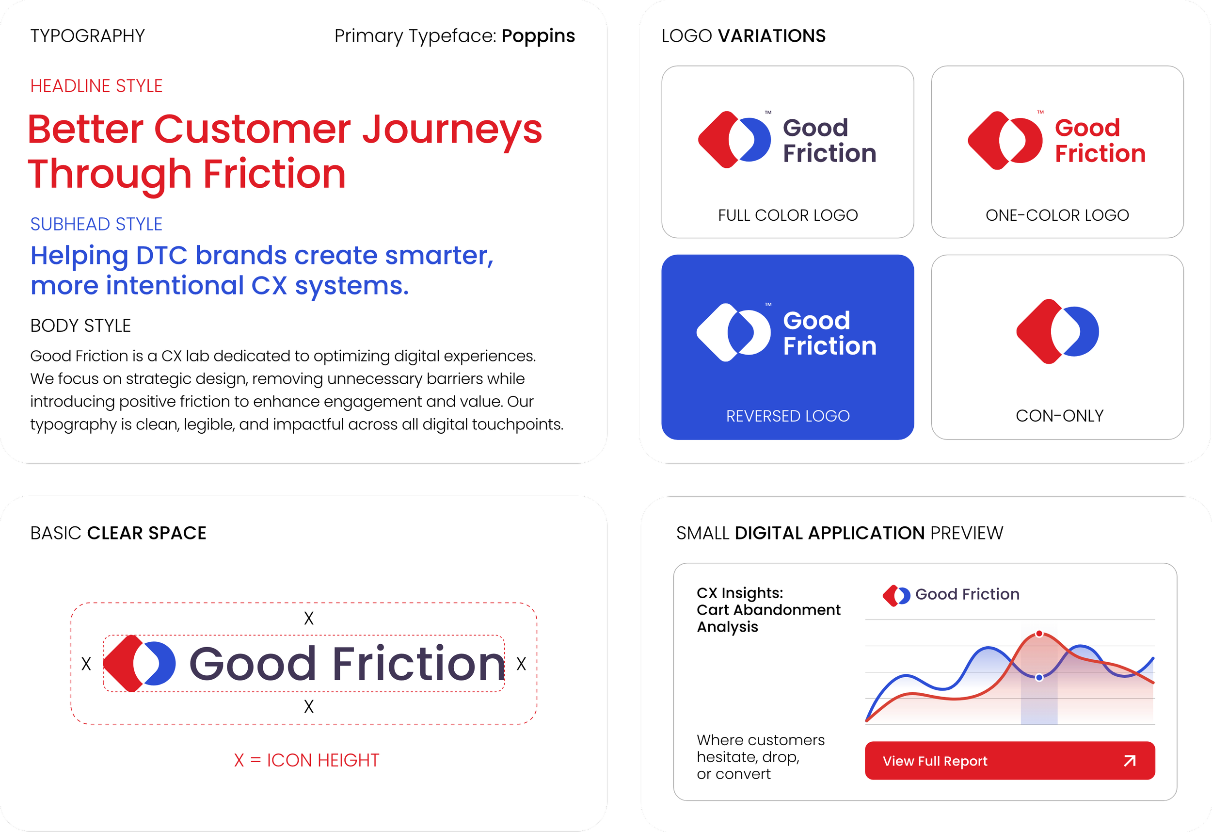
The project began with the client’s early exploration of circle and square relationships, supported by a red and blue visual direction. From there, I developed a more refined logo system that moved beyond simple overlap and into a stronger, more ownable brand mark. Using Adobe Illustrator, I shaped the final symbol around the interaction between a rounded diamond form and a circular element, creating a visual language that suggests structure, movement, and constructive friction. I also built the supporting wordmark, color palette, and a concise mini brand guide to make the final identity feel cohesive and ready for digital use.

Brand Strategy
The strategic focus was to create a logo design that felt intelligent and modern without becoming overly cold or generic. The red form brings confidence, structure, and directional energy, while the blue circular form introduces softness, balance, and a more human quality. Their interaction became the core of the identity, representing the point where clarity, empathy, and systems thinking meet. The final brand identity system was designed to feel distinctive in digital environments while remaining flexible enough for icons, lockups, headers, and future UI-led brand applications.
Project scope
Primary logo and secondary lockups
Icon-only mark and supporting wordmark
Brand color palette and typography direction
Three-page mini brand guide
Organized source files and exports for digital and brand presentation use
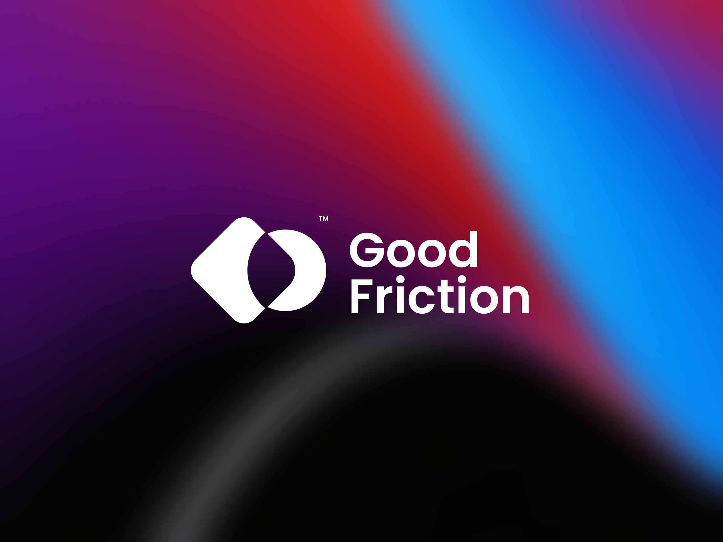
The result is a focused branding system that gives Good Friction a clear and recognizable foundation as it grows.