

Namino Logo & Character Branding Design | KFC-Inspired Custom Identity
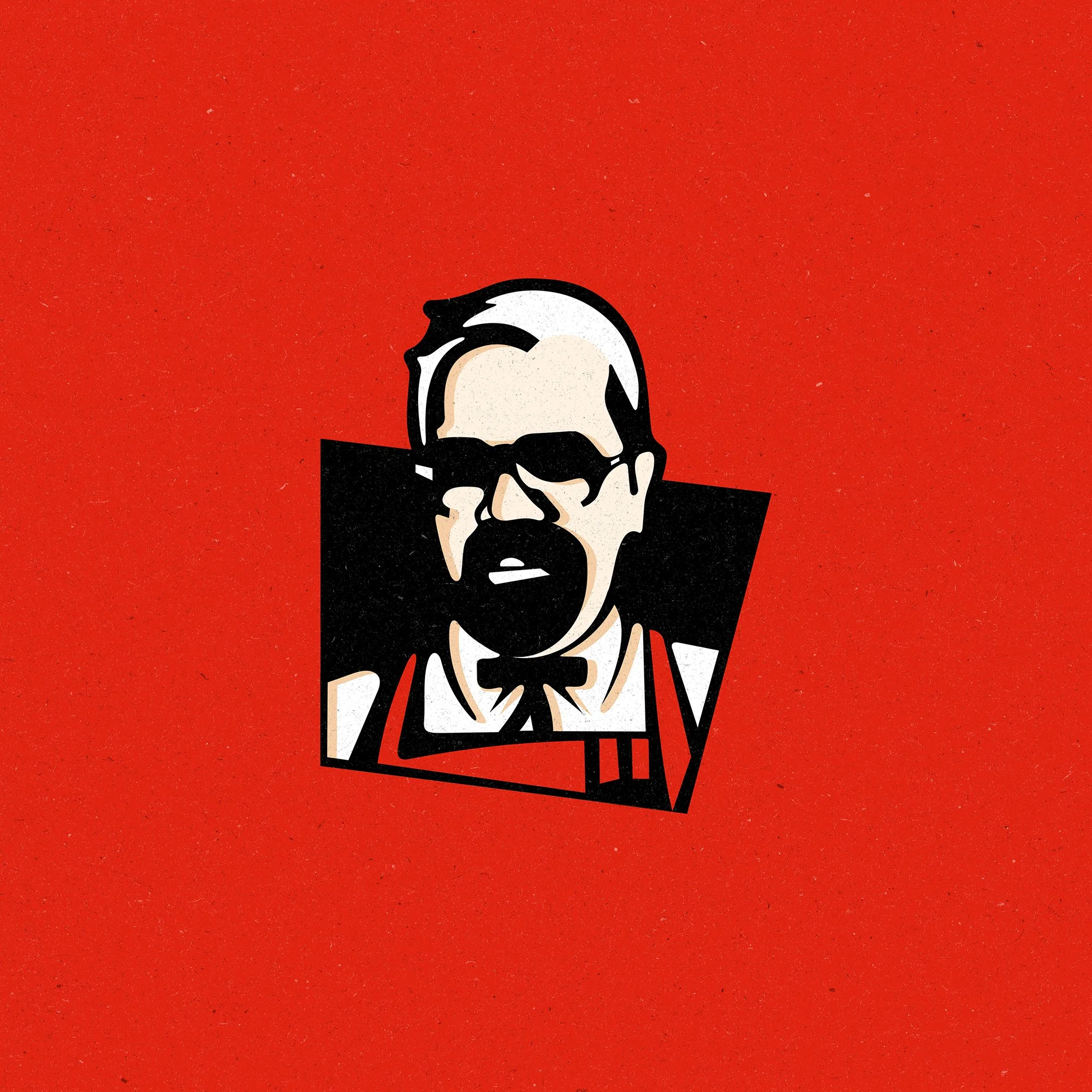
Namino was one of the most creatively demanding branding projects I’ve tackled. The client specifically requested a logo inspired by the iconic KFC design—but with a personal twist: it had to include a stylized illustration of himself. This added a unique layer of complexity, requiring careful balance between homage and originality.
LOGO DESIGN
BRAND IDENTITY DESIGN

Project Process
As a Graphic Designer, I began by analyzing the key visual components of the KFC brand—bold lines, limited color palette, and stylized portraiture. Using a photo of the client, I created a custom character illustration that mirrored the aesthetic while staying unique to Namino’s brand.
Applying strong graphic design principles, I translated this illustration into a full logo and branding setup. To ensure cohesion and professionalism, I established brand identity guidelines, and extended the visuals into advertising materials that maintained consistency across platforms.


Project Result
The final design successfully captured the spirit of the client’s vision—playful, recognizable, and rooted in pop culture inspiration—while standing as an original identity. The client was thrilled with the result, which exceeded expectations and became a centerpiece in their marketing.

